Be inspired by the new colour trends for 2018
If you’ve been thinking about freshening up your living space with a coat of paint, now could be the perfect time to unpack your paint brushes and throw down some drop sheets.
Date
9 October 2017
Share
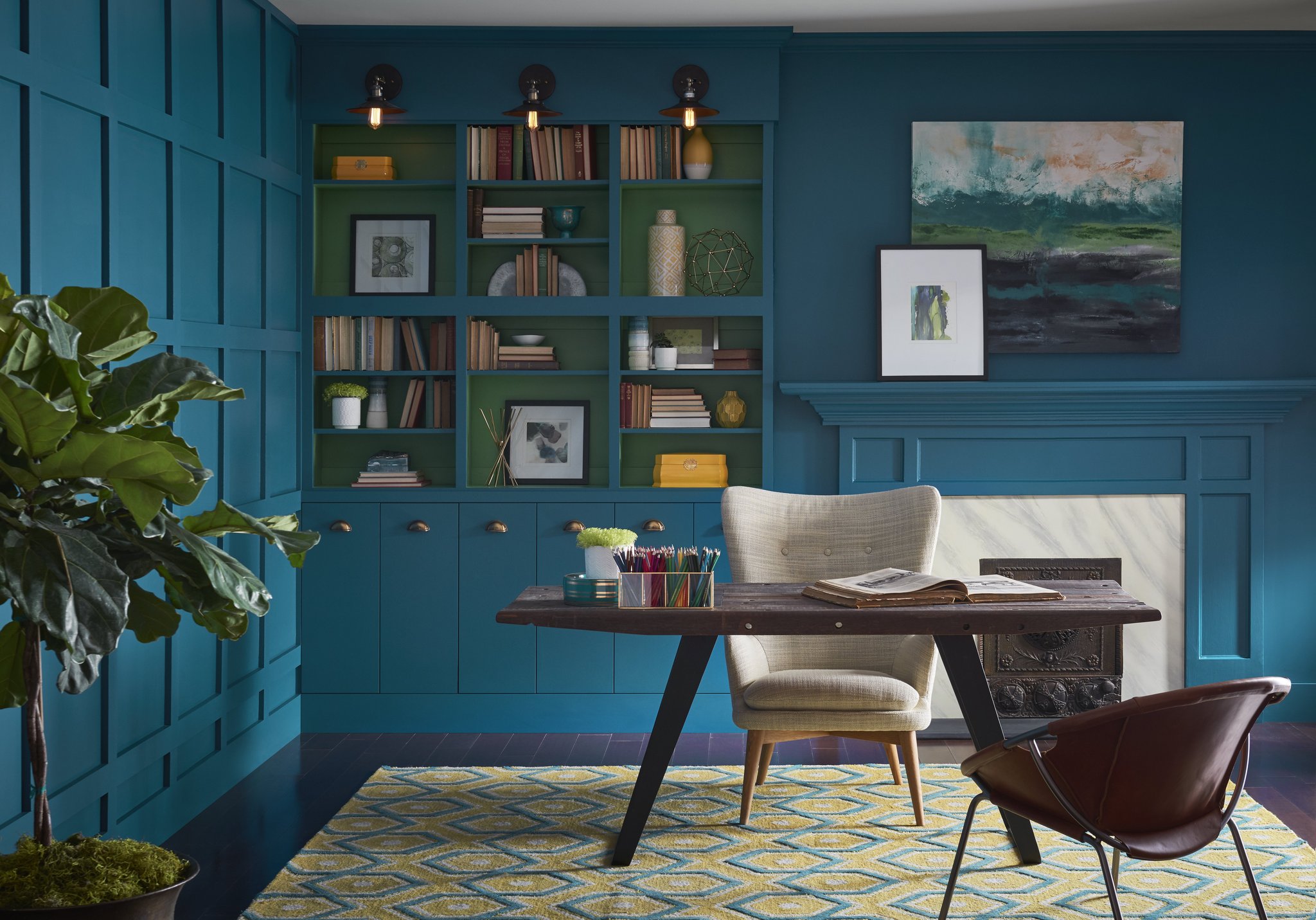
PHOTO CREDIT: Sherwin-Williams | Oceanside.
If you’ve been thinking about freshening up your living space with a coat of paint, now could be the perfect time to unpack your paint brushes and throw down some drop sheets. Spring brings longer daylight hours, which gives you more time to get in that extra coat, while lower humidity and warm breezes help to speed up drying.
For most of us, the trickiest part of painting is settling on a colour for your chosen room. Luckily, colour leaders like Taubmans and Sherwin-Williams have recently released their trend predictions for next year, which gives you plenty of time to get ahead of the crowd and pick a bold hue that’s sure to impress.
When Taubmans announced their colour of the year for 2018, it definitely ruffled a few feathers. The shade, titled Black Flame, is described as “an unprecedented statement-making black with tones of indigo”.
It might seem daring and harsh, but experts suggest that black actually helps to make a room feel more tranquil, creating a sense of silence and peacefulness. Paired with natural wood tones, light furnishings and metallic accessories, black could be the perfect breath of fresh air for your home office or lounge room.
If you really can’t be convinced that black is the right colour for your home, perhaps you’ll prefer Sherwin-Williams’ take on next year’s shade of the moment. Described as “an opulent and mysterious green-blue hue,” Oceanside is a colour that’s both confident and refined.

PHOTO CREDIT: Taubmans | Black Flame.
“We are craving things that remind us of bright folklore, like mermaids and expeditions across continents,” says the Director of Colour Marketing at Sherwin-Williams, Sue Wadden. “Oceanside is the colour of wanderlust right in our own homes.”
If you’re looking for a shade that’s not quite so adventurous, you may want to take a look at Sherwin-Williams’ colour palettes. The Sincerity palette is inspired by minimalism and Danish design philosophy, Hygge, and brings together sandy beiges, blush pinks and grey greens. The Unity palette combines shades of tan, navy and buttercup yellow, while the Connectivity palette features forest greens, soft lilacs and rusty reds.

PHOTO CREDIT: Sherwin-Williams | Sincerity Palette
Whether you’re brave enough to give black a try, or you’d prefer to play it safe and opt for something a little more muted, it’s totally up to you. But whatever you choose, you’re sure to enjoy your little makeover –because nothing reinvigorates a room quite like a coat of paint.